SARA KONIAREK

/01/
NEW YORK NITRO/2020/
nitrofrottage prints on pressed wood
21,8 x 30,5 cm

Over the course of seven days, several hours of footage was collected from various live webcams in New York City. During this rigorous process it was necessary to set alarm clocks during the night so that it was possible to experience the sunset twice a day.

/02/
CODE_WORT/2020/
mixed media

As part of my bachelor project I visually translated 21 German words that stem from different languages, so called borrowed words.Language is in constant motion. The changes in a language however span over such long period of time that we usually don‘t actively notice them.

Borrowing words from other languages is important as it defines the way we speak today. A lot of these words were adopted out of a necessity.

This project examines a hypthetical dystopian situation in which all borrowed words from other origins than German would be banned. Although this is a very radical approach its aim is to highlight how importnat intercultural exchange is for creating a more unified and considerate world.

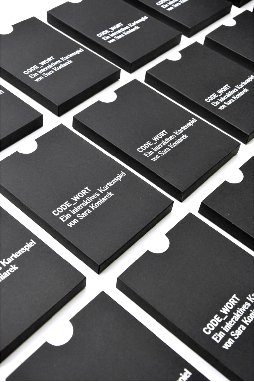
Printed on 21 cards the viewer can explore various quotes from everyday life. Within the texts all borrowed words from other languages are censored. On the the back of each card an individual QR code is printed that takes the viewer to a website where the visualization and explanation can be found.

/03/
DIGITAL COMMUNITIES AT CYBER ARTS
(PRIX ARS ELECTRONICA) /2020/
exhibition design and concept

This exhibition design was conceptualised and made for the Cyber Arts exhibition of the Prix Ars Electronica 2020.
It was shown in the OK museum in Linz from 09/09/20 until 15/09/20.
Digital Communities was one of the three categories of this years festival. It is a very diverse category covering a lot of different topics. The goal was to show which topics were dealt with in this years selection. In order to visually guide the visitor and get them engaged through a playful, intriguing design, different colors were used to show all these topics. Their meaning was displayed as a color key on small book marks which the visitors could take home. The grid behind the geometrical objects was representative of the networking and connections that make the category what it is.

Exhibition walkthrough:
https://vimeo.com/458603367

/04/
LUNZ/2020/
LED/light show for wellenklaenge-Festival

//click to play video

For the wellenklaenge-Festival in Lunz am See, our department was asked to create an LED light show/light animation to 4 compositions by Ganael Dumreicher. I collaborated with Andrea Probst for one of the tracks. The work will be shown through an installation by Univ.-Prof. Tina Frank, which uses numerous LED strips attached to the ceiling of the performance hall. Because the festival was cancelled this year, the results will be shown at wellenklaenge-Festival 2021

Concept: Sara Koniarek
Execution: 1st half: Sara Koniarek
2nd half: Andrea Probst

/05/
WASCHSTRASSE/PATTERN.SAMPLER/2019-20/
Video installation, planning & realisation of an experimental, temporary club

As part of the course „Klubkultur“ (club culture), lead by Univ.-Ass. Mag.arch. Clemens Bauser & Markus Reindl, the Kulturtankstelle in Linz was transformed into a temporary club. This multisensory experience welcomed its visitors with a 3-level-4 meters tall, bar, various art installations ,performances and visuals. The project was planned, built and realised together with students from various departments of the Kunstuniversität Linz. I was part of the teams responsible for the setting, visuals and communication.

The video Pattern.Sampler was created for this one night. It is an hommage to Darren Aronofsky‘s movie „π“ (Pi), and the patterns surrounding us on different levels every day. The hypnotic, constantly circulating video was projected onto sculptural installations by Matthias Grünwald and Luzia Stempfer.

/06/
IDIOMATIC COLORS/2019/
fine art prints on cardboard.
21 x 15 cm

Over the course of 5 weeks, a picture was taken every day at 5 o‘clock in the afternoon. Each picture, varying in level of abstraction, captures a unique texture and color code of whichever surrounding I was at, at that moment.The results were posted daily to the twitter account @ZaraKZaraKZaraK.The printed version is a fusion of hex color codes and idioms, associated with the respective color. It is an examination of how we categorize and associate colors in our everday life.

/07/
11°/2017-18/
Bromoil prints
30 x 30 cm

The experimental photographic work 11° is located at the threshold between past & present.

The technique aswell as the overall composition should trick the viewer into thinking they are looking at long forgotten photographs from a different time and place.

/08/
UNTITLED/2020/
photography

A collaboration with the buryat painter Yuma Radne and the dancer/model Odion Adonor.

/09/
UNBEHAGLICH/2019/
fine art prints from analog photography
50 x 50 cm

The photographic exploration of the german term Unbehaglich, follows the story of a young person struggling with social anxiety and disassociation.It represents the inner voice of doubt and and the mask to hide it from the outside..

/10/
YUMA/2020/
gum bichromite prints
30 x 30, 30 x 40 cm

The prints were created within the workshop Gummidruck by A.Univ.-Prof. Mag.art. Gerhard Umhaller, using the complex gum bichromite technique. The aim of this project was to blur the line between photography and painting, furthermore confusing the beholder about the origin and age of the prints.

/11/
UNTITLED/2020/
digital photography
40 x 40 cm

An experiment with colored lights

/12/
SOUND PROJEKT KAOS (SPK)/2018/20/
digital event invitation, silk screen prints.

/13/
JETHRO TULL ALBUM COVER/2018/
foldable vinyl cover and vinyl stickers

The LP cover for Jethro Tull‘s album Living in the past was created as an hommage to the artist and as part of the course „Illustration“ under the guidance of Blagovesta Bakardjieva. The folding technique enables the cover to stand on itself. When unfolded it can double as a typographic poster.

/14/
KAREL MARTENS FANZINE/2018/
fanzine

During the research for this fanzine, I noticed similarities in the dynamics of the working processes of Karel martens, The Dutch Nul Group, and those who paved the way for the subcultural movement of the 1980s and 90s in Linz. The printed result was a typographic juxtaposition of the two.